How to define your interior style in six steps, without copying a moodboard
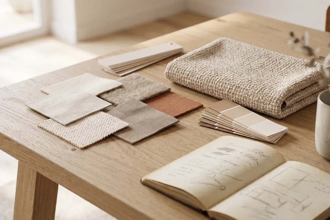
A personal style is a set of rules you can say out loud. Until you get there, you buy piece by piece and hope it all fits together.
Most people start the other way around: they collect photos, then try to reproduce them. The result looks like a collection of other people's rooms, put in the same house.
The process below goes in the right order, from what you already know about yourself to decisions you can check in a store.
Key takeaways
- Style is extracted from the decisions you have already made, not imported from an image gallery.
- A preference becomes useful only when you translate it into testable parameters: contrast, texture, density, light temperature.
- Real constraints, meaning the room's light, the budget and who does the cleaning, eliminate half the options before you buy anything.
- The outcome of the process is a one-page sheet you can use as a filter in the store, not an inspiration collage.
Step 1. Start from what you have kept
Look at the objects you have moved with you twice. A lamp, a chair, a mug, a blanket. They are not there by accident.
For each one, write down a single word that explains why it stayed: the material, the weight, the color, the way it feels to the touch. Five objects already give you a pattern.
Step 2. Gather twenty images and look for repetition
Save twenty spaces you like, from different sources. Then put them side by side and ignore the objects completely. Look at only three things: how much natural light they have, how full the walls are and which materials repeat.
You will almost always find two or three materials that appear in fifteen of the twenty images. Those are yours. The rest is noise.
Step 3. Translate preferences into parameters
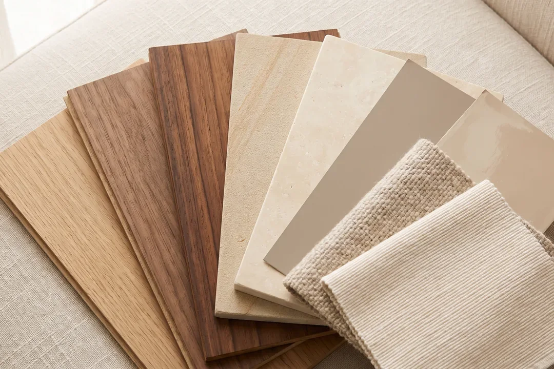
“I like warm and welcoming” is not an instruction. A parameter is something you can check in a store, with your hand on the product.
|
Parameter |
The test question |
How it translates into a decision |
|---|---|---|
|
Contrast |
Do I like spaces where everything is in the same range, or ones with clear differences? |
The difference between walls, floor and furniture, measured in steps of lightness |
|
Texture |
Do I want smooth surfaces, or do I want to feel the material? |
Limewash and textured plaster versus washable paint, brushed wood versus foil veneer |
|
Density |
Do I rest better in a pared-back room or in a full one? |
How many objects stay on open surfaces and how much wall stays bare |
|
Light temperature |
In the evening, do I want yellowish or neutral light? |
2700K for relaxing, 3000K for work areas in the home |
|
Shape |
Am I drawn to straight edges or rounded shapes? |
The furniture profile, the corner radius, the shape of the light fixtures |
|
Color |
What color do I wear most often, and what do I feel good in? |
The base palette for the walls and large textiles |
Step 4. Run everything through the real constraints
This is where many choices fall away, and it is good that it happens now, not after delivery.
The room's light. A north-facing room makes cool colors look dirty. The same paint looks different facing south. Test a sample on the wall and look at it in the morning and in the evening, not in the store.
Who does the cleaning, and how often. A light-colored fabric on the sofa, in a house with a dog, is a maintenance decision made in place of an aesthetic one.
The budget, split into layers. The heavy layer, meaning the flooring, windows and doors, and built-in furniture, takes the largest share. The light layer gets filled in over two years, without undoing anything.
Step 5. Write the one-page style sheet
One page, seven lines, no photos:
- Three base materials, in order of importance.
- The wall color range, with two shades at most.
- The contrast level, stated simply: low, medium or high.
- Light temperature, by zone.
- Accepted density: how many objects stay in view.
- Two things you turn down, no matter how good they look.
- The budget for the heavy layer and for the light layer.
This sheet does more than fifty saved images, because it tells you what to turn down.
Step 6. Use the sheet as a filter, not as a shopping list
In the store, the question is no longer whether you like the object. You like almost any beautiful object in a store, under well-designed lighting.
The question is whether it meets the seven parameters. If it fails one, you put it back. If it fails one but is cheap and easy to swap, you can take it as an experiment.
Mistakes that keep repeating
- Choosing the wall color before the flooring, when the flooring is the part that does not change.
- Buying large furniture without a scale plan, which ends with a 60-centimeter walkway.
- A single ceiling light, followed by the complaint that the room feels cold in the evening.
- Confusing style with a single label, like “japandi” or “industrial”, which then blocks any decision that does not fit.
The SelfDezign perspective
The industry confuses style with identity. Style can be copied, because it is visible. A space's identity comes from the reason the decisions work together, and that reason is yours.
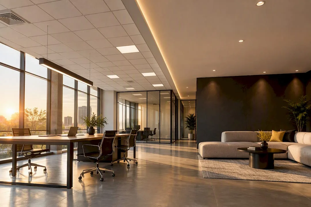
In commercial projects we do exactly the same exercise, except the parameters come from the business: who walks in, at what time, how long they stay and what they need to feel in the first ten seconds. You can see what that looks like in our projects.
Do you have a space in the works and want a tested direction before you buy anything? Let's talk.