The role of textures in interior design: a guide to harmonious spaces
Texture is the element that gives an interior space a distinct tactile and visual dimension, maintaining visual interest and preventing chromatic monotony. Without textures, an interior stays flat no matter how well the colors or furniture are chosen. Texture is "what the eye feels"en/colors-and-textures-how-to-combine-visual-elements/) and ensures essential visual depth in any design project. The role of textures in design goes beyond aesthetics: they influence the well-being of the occupants, the perception of dimensions and the quality of the atmosphere. SelfDezign treats texture as a design tool, not as a decorative detail added at the end.
How textures influence the perception of interior space
Texture changes how you perceive the dimensions, light, and atmosphere of a room. It is not a subjective impression, but a documented effect of how surfaces interact with light and gaze.
Fine textures vs. large textures: effect on dimensions
Texture can amplify or diminish the perception of dimensionsof the room. Fine and uniform textures applied to walls or floors visually open up small spaces. A discreetly textured wallpaper in a narrow corridor creates the feeling of width without visually loading. Large and pronounced textures, such as rough stone or wood with visible fiber, anchor the space and make it look more intimate. The wrong choice between the two categories is one of the most common errors in residential developments.
Light and texture: an inseparable couple
Light is complementary to texture, transforming visual and tactile perception according to its type and positioning. A concrete surface apparently looks completely different in daylight in the morning from warm artificial lighting in the evening. Matte textures absorb light and create a calm atmosphere, while glossy or metallic textures reflect it and add energy. This dynamic means that you cannot evaluate a texture from a sample seen in the store. It must be tested in the real space, at the hours and types of light specific to that room.
Contrast textures for visual depth
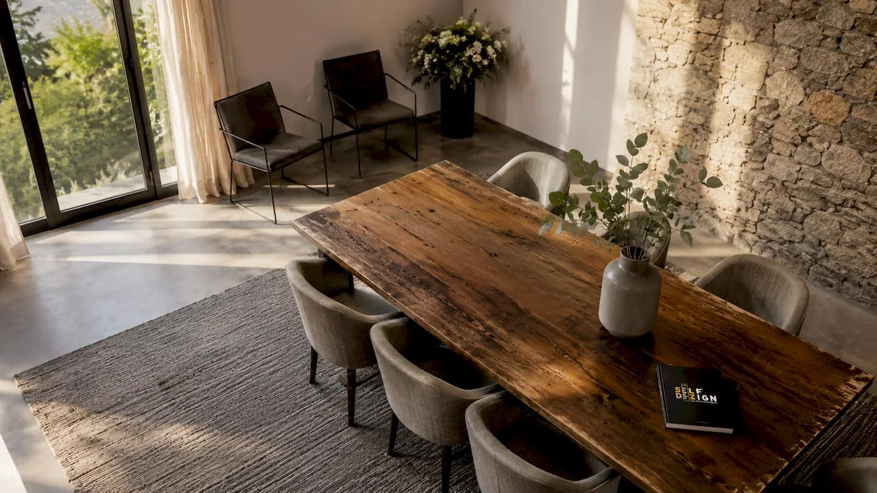
Combining fine textures with rougher elements creates depth and a balanced look. A velvet sofa next to a raw wood table, or a jute carpet under an armchair upholstered in linen, are contrast examples that work. Contrast does not mean visual clutter. It means that each surface has a clear role in the composition, and the eye has where to rest and where to be stimulated. Without contrast, an interior becomes monotonous even if it is well colored.
- Fine textures(silk, satin paint, glass): open the space, reflect the light, add elegance
- Medium textures(linen, cotton, polished wood): visual balance, tactile comfort, versatility
- Pronounced textures(stone, concrete, thick wool, rattan): anchors space, adds character, creates privacy
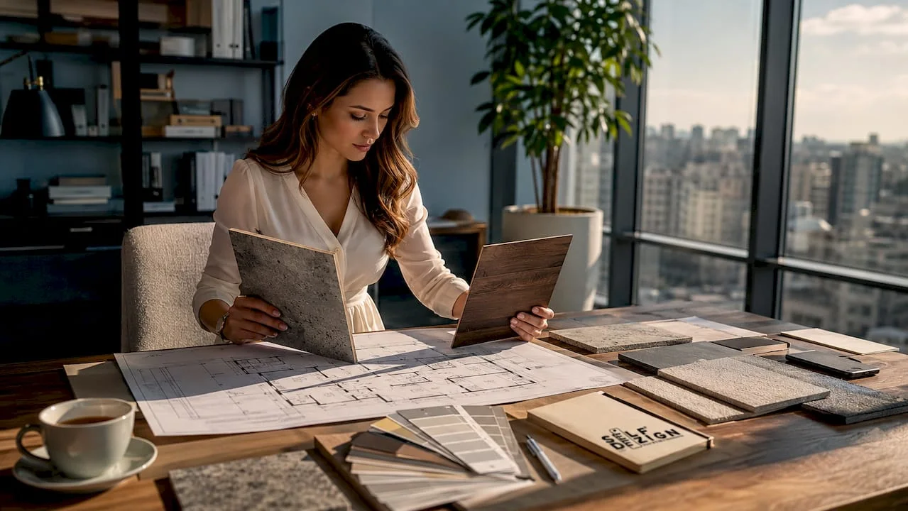
Professional advice: Test the material samples directly on the wall or surface where they will be applied, in natural light and in the artificial lighting you will use. A texture that looks perfect in the showroom can look completely different at home.
Best practices for combining textures in landscaping
Combining textures isn't intuitive for everyone. There are some clear principles that make the difference between a balanced space and one that seems overloaded or, on the contrary, lacks personality.
How many textures are enough in a space?
The optimal number of distinct textures in a room is 3–5. Under three, the space risks looking sterile. In five, it becomes visually tiring. This rule does not mean that you use exactly three materials, but that there are three texture "families" that dominate: a basic one (flooring, walls), a middle one (furniture, curtains) and an accent one (pillows, decorative objects, carpet).
Steps for a correct combination of textures
- Sets the dominant texture.It occupies the largest area in the room, usually the floor or walls. It sets the tone for the entire layout.
- Choose a secondary texture.The main furniture or curtains introduce the second texture family. It must contrast slightly with the dominant one, not repeat it.
- Add accent texture.Pillows, carpet, decorative items or plants bring the third dimension. This can be bolder precisely because it occupies a small area.
- Check your visual balance.Look at the camera at the entrance. If your eye stops on a single point and stops moving, you have an imbalance. Textures must guide the gaze through the space.
- Adapts to the camera function.A bedroom demands soft and warm textures. A desk works better with structured and less soft textures. A common mistake is neglecting the room-by-room balance between textures.
Professional advice: If you're not sure if a combination works, take a photo of the camera and look at the image in black and white. Without color, textures become visible in isolation, and you can more easily assess whether there is enough contrast and balance.
Common mistakes to avoid
The most common mistake is to combine materials with similar textures in intensity, for example concrete on the floor, concrete on the wall and concrete on the kitchen countertop. The result is a space that looks like a tunnel, not an inhabited room. Another mistake is to add unrelated accent textures to the rest of the composition, such as a carpet with a strong geometric pattern in a space with organic textures. Accent textures should dialogue with the dominant ones, not contradict them.
Why Natural Materials Matter in Contemporary Design
The current trend in 2026 is clear:organic materials, especially wood and natural stone, is gaining ground in the face of synthetic finishes. This preference is not just aesthetic. Authentic natural materials increase real estate value and provide a visual signal of quality and refinement. They bring inside a texture that no synthetic material can completely replicate: natural variation, controlled imperfection, tactile depth.
Benefits of natural textiles indoors
Natural textiles like flax, wool and jute aren't just beautiful. They regulate indoor humidity, reduce allergens and contribute to real environmental comfort.Varying tactile textures, including velvet, wool or brushed metal, reduce stressand increase the well-being of the occupants. This means that choosing a wool carpet or linen drapes is not just an aesthetic decision. It's a decision that directly affects the quality of life in that space.
|
Natural material |
Texture |
Primary benefit |
Recommended usage |
|---|---|---|---|
|
Lemn |
Medium to pronounced |
Visual and tactile warmth |
Floors, furniture, cladding |
|
Natural Stone |
Pronounced |
Durability, coolness, character |
Bathrooms, kitchens, accent walls |
|
In |
Fine to Medium |
Humidity regulation, comfort |
Curtains, upholstery, bed linen |
|
Wool |
Medium to thick |
Thermal insulation, allergen reduction |
Carpets, pillows, upholstery |
|
Jute |
Pronounced |
Organic texture, strength |
Mats, baskets, accessories |
|
Bumbac |
Fine: |
Breathability, versatility |
Textiles, lightweight upholstery |
Affordable solutions for natural textures
Not every project allows budget for natural stone or solid wood. Decorative paints mimic premium textures at low cost and are a real alternative to walls. Wallpapers with mineral texture or concrete effect recreate the appearance of natural materials without their cost.Natural stone in sustainable designbrings long-term benefits that justify the investment where the budget allows it. The choice between the original and the alternative depends on the surface and the visibility of the element in the space: for a focal wall, the authentic material makes the difference; for secondary surfaces, the decorative alternatives are completely valid.
How to choose the right textures for each type of space
Adapting textures according to the purpose of the space, relaxation or productivity, is essential for a quality design. There is no one-size-fits-all recipe, but there are clear logics for each type of room.
Bedroom and seating areas
The bedroom demands textures that communicate safety and comfort. Soft surfaces dominate: cotton or linen underwear, fluffy carpet, heavy velvet or wool curtains. The walls can be finished with velvety effect paint or fine textured wallpaper. Warm wood completes the composition without adding stiffness. Avoid cold, hard textures, such as concrete or metal, as dominant elements in the bedroom. They may appear as small accents, but they don't need to set the tone of the space.
Offices and workspaces
Workspaces benefit from more structured and less soft textures.Modern office texturesmust support concentration, not distract it. Wood or sandstone floors with medium texture, walls with matte finish or discreet geometric wallpaper and furniture with clear and clean surfaces create a functional working environment. Simple patterned jute or wool rugs add acoustic comfort without visually burdening. Excessive soft textiles, such as throw pillows or heavy curtains, reduce the feeling of efficiency.
- Bedroomvelvet, wool, cotton, warm wood, velvety paint
- Livingmix of textures, contrast between soft and hard, carpet as a central element
- Office:structured textures, clear surfaces, acoustics through discreet textiles
- Bath:stone, textured ceramics, absorbent textiles, moisture-resistant wood
- Kitchen:easy-to-clean surfaces, contrast between countertop and furniture front
Coordination of textures with colors and lighting
Texture and color do not work independently. A neutral color on a pronounced textured surface looks completely different from the same color on a smooth surface. Dark colors on matte textures absorb light and create depth. Light colors on glossy textures reflect light and open up the space. SelfDezign approaches this coordination as a system, not as a series of separate decisions. Each element, texture, color and light, is valued in relation to the others, not isolated.
INFORMATION: When coordinating textures with colors, always test the samples together, not separately. The color of a material changes depending on the texture of the neighboring surface.
You can also check out the SelfDezign guidebook oninnovative materials in 2026to understand how the options available in current projects are evolving.
What I learned about textures after years of real projects
There is a big difference between understanding the theoretical textures and applying them in a real project with budget, light and customer preference constraints.
The first thing I noticed is that most people choose textures visually, from pictures or showroom, and they are surprised when the end result looks different. Texture does not exist in isolation. She lives in relation to the specific light of the space, the neighbouring colours and the other materials in the room. A sample of wallpaper that looks perfect on the screen may seem too aggressive on a 10-foot wall, or too shy if the natural light is poor.
The second thing is that textures build the bridge between functional and aesthetic, avoiding stiffness by creating a welcoming space. Customers who come with references of minimalist spaces with a lot of concrete and metal often realize that those spaces work in photos, but they are hard to live in on a daily basis. The soft texture, be it a carpet, pillow or curtain, is what makes the difference between a space that looks good and one you want to stay in.
The third thing, and perhaps the least intuitive: less is more, but only if you choose well. A single authentic, well-chosen and well-placed natural material makes more than five inexpensive materials combined without logic. The quality of the texture is felt, even by those who do not know how to name it. When you walk into a space and feel that “something is different,” it's usually the texture.
My recommendation to anyone who arranges a space: don't leave the texture for last. It's not a detail. It is the sensory structure of the camera.
says Irina Stoica
SelfDezign and texture integration in your projects
Choosing the right textures for a residential or commercial space is not a decision you make from a catalog. It depends on the specific light of the space, the function of the room, the materials already in place, and the identity you want to communicate. SelfDezign works with clients in Bucharest and Europe on residential, office, commercial and medical clinics projects, integrating texture as a design element, not as an added finish at the end. If you want to understand how it worksresidential interior designcustom or how to build a workspace that supports productivity, the SelfDezign team can clarify the real options for your project, before any execution decision.