What chroma represents in interior design: a practical guide for 2026
Chromaticity in the interior is the set of color decisions that define the atmosphere, visual balance and functionality of a space. It's not just about what colors you “like,” but how those colors interact with each other, the light, and the materials in the room. Owners who understand color in decoration make safer decisions and achieve more consistent results. Basic tools, such as the color wheel and the 60-30-10 rule, transform subjective choices into decisions with clear logic. This guide explains these tools, the psychological effects of colors, and concrete steps to building a palette that really works in your home.
What the chromatic represents in the interior and how to apply it
Chromatics in interior design is the discipline that studies the relationships between colors and how they influence the perception of a space. The technical term used by designers ischromatic harmony, and understanding it gives you a clear framework for any color decision. Without this framework, choices remain intuitive and difficult to correct later.
The first tool any designer uses is the color wheel.Color wheelprovides clear schemes: complementary (opposite colors on the wheel, such as blue and orange), analogous (neighboring colors, such as green, yellow-green and yellow) and monochromatic (shades of the same color). Each scheme produces a different effect: the complementary creates contrast and energy, the analogue brings cohesion and tranquility, the monochromatic conveys elegance and depth.
The second fundamental instrument is rule 60-30-10.Rule 60-30-10involves allocating 60% of the visible area of the room to a dominant color, 30% to a secondary color and 10% to contrasting accents. This distribution ensures balance without monotony. The dominant color appears on walls and large surfaces, the secondary one on furniture and textiles, and the accents on decorative objects, pillows or paintings.
What the 60-30-10 rule looks like in practice
ProcentRolExamples of surfaces60%Color dominantWalls, floor, ceiling30%Sub ColorSofa, curtains, carpet10%AccentePillows, vases, paintings, lighting fixturesIf you choose a warm gray as a base (60%), a beige or sage green as a secondary (30%) and a terracotta as an accent (10%), you get a balanced room with personality, without looking overloaded. The same principle works regardless of the chosen style, be it minimalist, Scandinavian or eclectic.
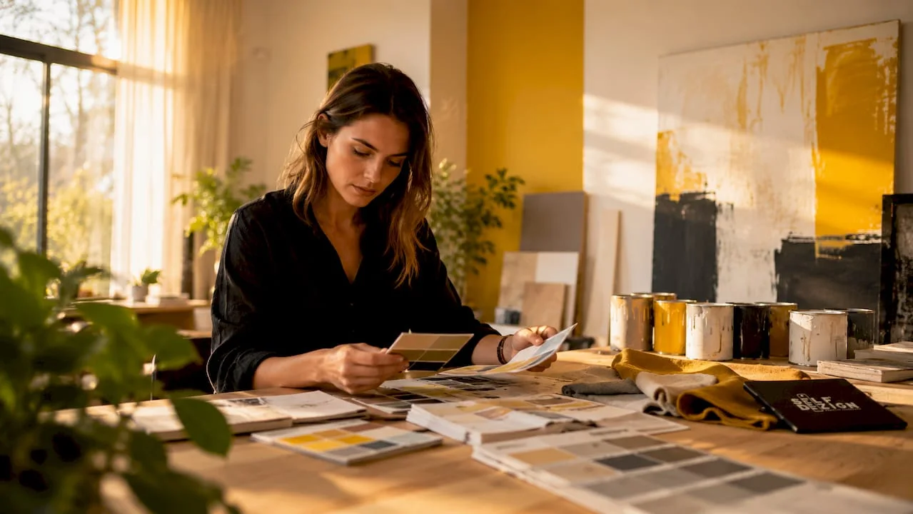
INFORMATION: Before buying paint or furniture, build a physical or digital mood board with real samples. Put together the materials, colors, and textures you're considering and evaluate them together, not separately.
How do colors influence the perception of space and mood?
Color doesn't decorate a space. Color builds it emotionally.Warm colorscreates a welcoming and energizing atmosphere, and cold ones induce calmness and relaxation. This difference is not subjective, but is based on how the nervous system processes visual stimuli.
Warm colors, such as red, orange, and yellow, stimulate activity and conversation. They are suitable for dining rooms, kitchens and workspaces where you want energy and dynamism. Cold colors such as blue, green, and purple reduce the perceived heart rate and promote concentration or rest. They are the natural choice for bedrooms, bathrooms and offices where you want mental clarity.
How colors change the perceived size of the room
Light colors create the feeling of ample space, and dark colors can make small rooms feel more comfortable if dosed correctly. This is one of the most useful information for owners working with small spaces or with difficult proportions.
Some concrete effects you can use:
- White and very light shadesreflect the light and make the ceilings look higher.
- Saturated colors on a single wallcreates a focal point without visually pressing the entire room.
- Green & Beigeare emotionally neutral and work in almost any room.
- Black and Graphite, used in small doses, adds depth and visually anchors a space.
- Pale yellowbrings light to north-facing rooms where natural light is limited.
The effect of colors on the state depends not only on the hue, but also on saturation and brightness. An intense blue can be as stimulating as a red if saturation is high. A powdered pink can be as soothing as a gray if the brightness is correct. Understanding these variables gives you much more freedom than a simple list of “good colors” and “bad colors.”
Professional advice: If you want to test the effect of light on a color, apply a sample of at least 30 x 30 cm directly to the wall and observe it in the morning, noon, and evening. The same shade may seem completely different depending on the time of day.
What are the best practices for combining colors?
Combining colors in the interior follows a few clear principles that prevent costly mistakes. The first principle is chromatic continuity between rooms.
1. Establish a common neutral base
A solid neutral baseensures fluidity between rooms and enhances color accents, maintaining balance and avoiding visual overload. Basically, choose a warm white, light gray, or beige as the background shade that appears in all rooms, even in small proportions. This prevents your home from feeling like a collage of unrelated rooms.
2. Integrates natural materials for balance
Natural materialssuch as wood or vegetable fibers balance the intense chromatic palettes and make the spaces more welcoming. Natural wood, in particular, adds visual warmth that no single colour can reproduce completely. If you chose a palette with cold or saturated tones, a wooden element, be it a table, a shelf or a parquet, rebalances the entire ensemble. You can also find inspiration ininnovative materialscombining natural texture with contemporary finishes.
3. Apply color drenching technique for small spaces
Color drenching involves applying the same shade to walls, skirting boards and ceiling, blurring visual boundaries and seemingly enlarging small spaces. This technique contradicts the idea that only white expands a small room. A dark green applied evenly on all surfaces of a small bathroom creates a flirtatious and intentional feeling, not cramped. The secret is consistency: any disruption of the shade, be it a white plinth or a ceiling of another color, cancels the effect.
4. Avoid common mistakes in color in decoration
The most common mistakes I see in residential developments are:
- Using too many colors without a clear scheme, which produces visual chaos.
- The choice of colors exclusively from catalogs, without wall testing in the real light of the space.
- Ignoring finishes: the same matte, satin and glossy white looks completely different in the same room.
- Treat accents as a last-minute idea, instead of being planned from the start as part of the scheme.
INFORMATION: Chromatic accents make up about 10% of the palette and are the easiest item to change without renovation. Pillows, vases, paintings, and textiles can completely update the look of a room in a matter of hours and on a small budget.
How do you choose the right color palette for your space?
Choosing the color palette for a room doesn't start with a paint catalog. Start with an assessment of the space itself.
Evaluate natural light.The orientation of the camera relative to the cardinal points determines the quality of light throughout the day. A south-facing room receives warm, direct light, which allows cooler shades without looking cold. A Nordic room receives diffuse and cool light, so it needs warm shades for balance. Testing shades directly on the walls is recommended to observe the effects of natural light at different times of the day. No sample in the catalogue replaces this check.
Take into account the function of the camera.The bedroom demands colors that favor rest: tones of blue, sage green, lavender or warm neutral shades. The kitchen and dining room tolerate more energy: warm yellows, terracotta, dark green, or accents of red. The home office benefits from colors that support concentration without tiring the eyes: light gray, muted green or dense blue. You can go deeperthe role of colorsin each type of space to make more accurate decisions.
Adapts the palette to the size of the room.Some clear principles:
- Small rooms benefit from light colors on large surfaces and saturated accents on small surfaces.
- Large rooms can withstand dark colors on all walls without becoming oppressive.
- Low ceilings look higher if they are painted a lighter shade than the walls.
- Long, narrow corridors look wider if the end wall is painted in a darker color than the side walls.
Balance trends with personal preferences.Chromatic trends are changing rapidly, and a room arranged strictly by trend risks looking dated in a few years. Use trends as inspiration for accents, not basic colors. The base remains neutral and durable; accents can be updated easily and without high costs.
Plan flexibility from the start.Chromatic accents provide dynamism and personality and are easily changeable for quick design updates. If the base is solid and neutral, you can completely change the atmosphere of the room just by replacing textiles and decorative items, without repainting or refurbishing.
Chromatics is not aesthetic. It is strategy
I've been working with residential spaces long enough to notice a clear pattern: owners who treat color as an aesthetic decision end up changing it. Those who treat it as a functional decision come to love it.
The most common regret I hear is: “I chose the color after a photo on the internet and in my room it looks completely different.“ The reason is simple. The photo doesn't have your light, your proportions, or your materials. Chromatic does not work in isolation. It works in context.
Chromatic harmony is more than framing colors. It is a visual and emotional continuity between spaces that conveys unity and supports the functionality of ambiences. This is the difference between a house that looks good in photos and one that feels good in real life.
The trend I see most often in recent projects is the desire for bold color without the courage to apply it consistently. Owners choose an intense green for one wall, then "temper" it with white on the other three, with a beige carpet and gray furniture. The result is a color that fails to say anything. Color drenching, applied correctly, would have solved exactly this problem: a green applied on all walls, skirting boards and ceiling would have created a real space.
My practical advice: choose fewer colors and apply them with more courage. A well-applied two-color palette does more than five hesitant colors.
— expertise provided by Irina Stoica
SelfDezign and chromatic harmonization of your spaces
The chromaticity of a residential space is not limited to choosing a paint. It involves understanding light, proportions, materials, and how they all interact. SelfDezign works with owners in Bucharest and across Europe to createresidential spacesthat reflects the identity of each customer, not trend formulas. The approach starts from the real context of the project: the orientation of the space, the lifestyle of the owner and the long-term functionality. If you want a space where color and functionality work together, not separately, SelfDezign offers complete consulting and design, from concept to implementation.


