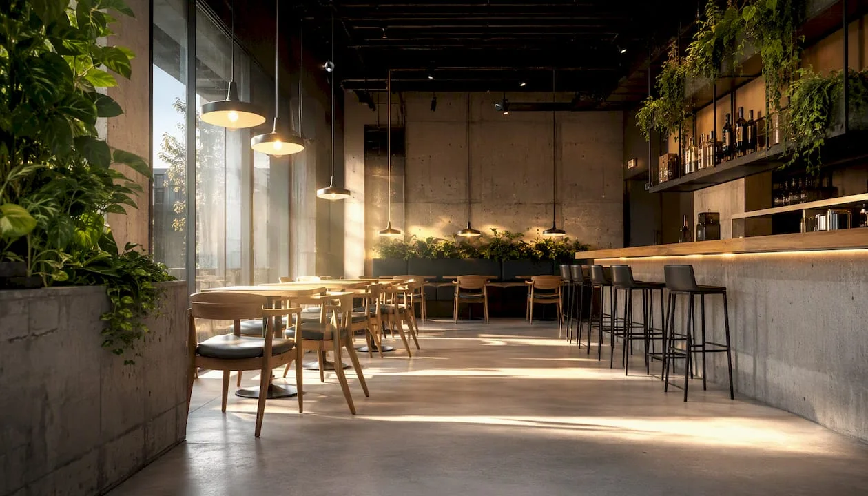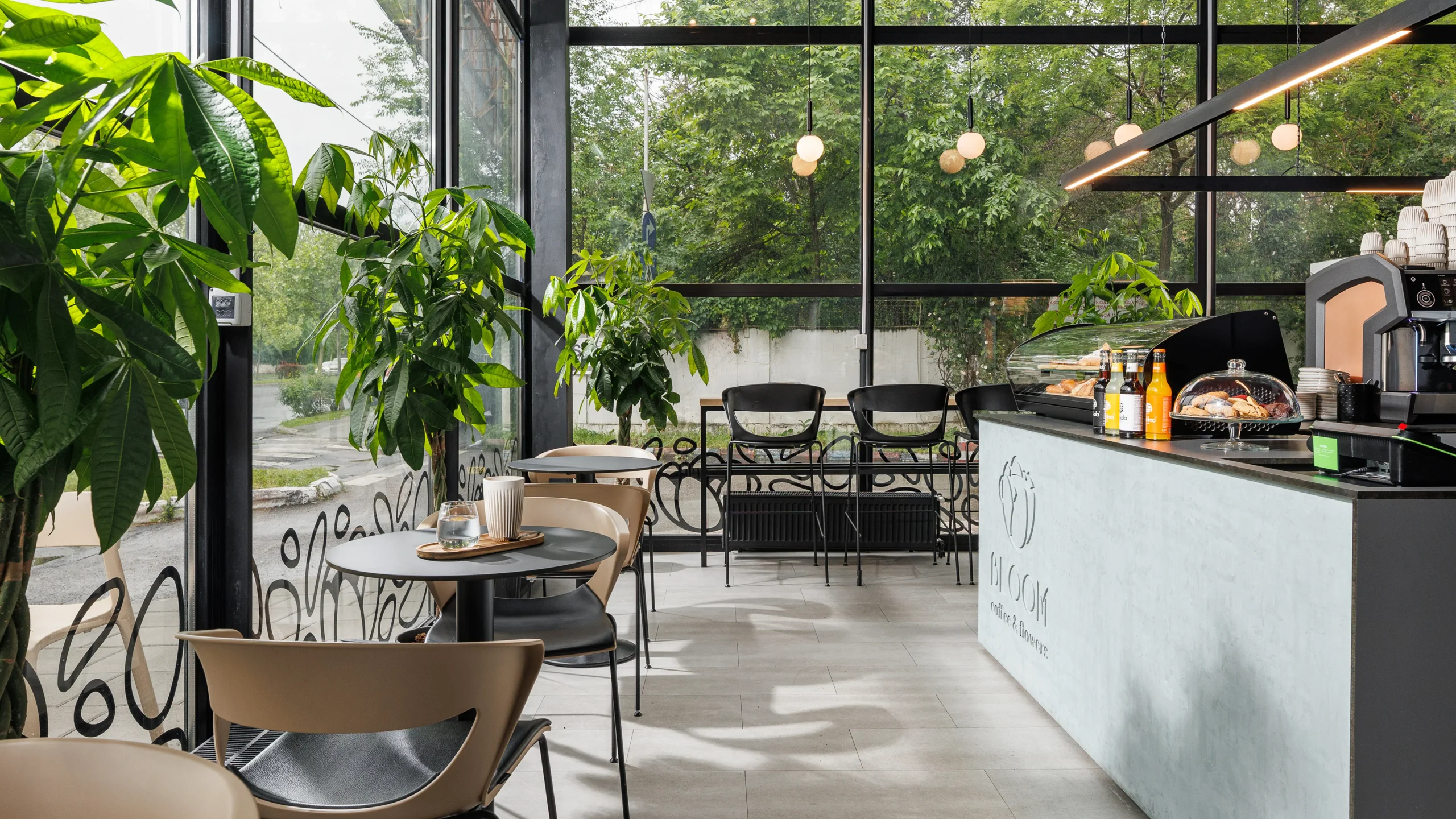
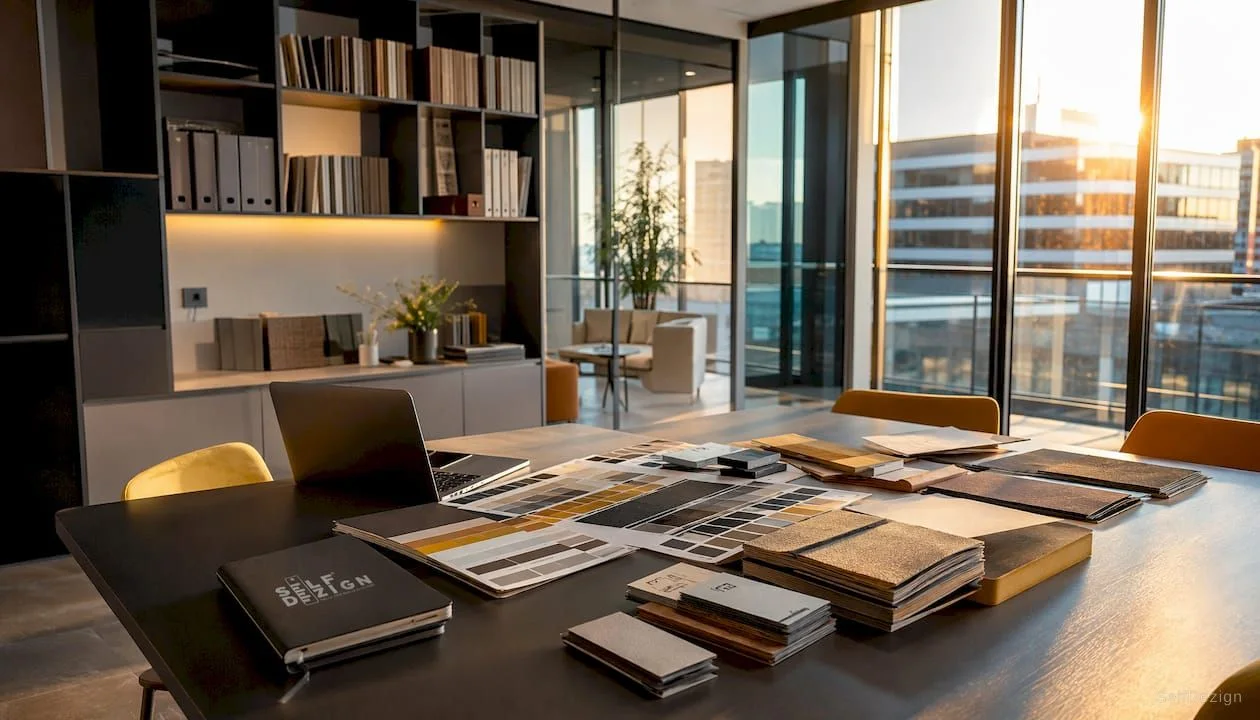
The role of chromatics in commercial spaces: strategic guide
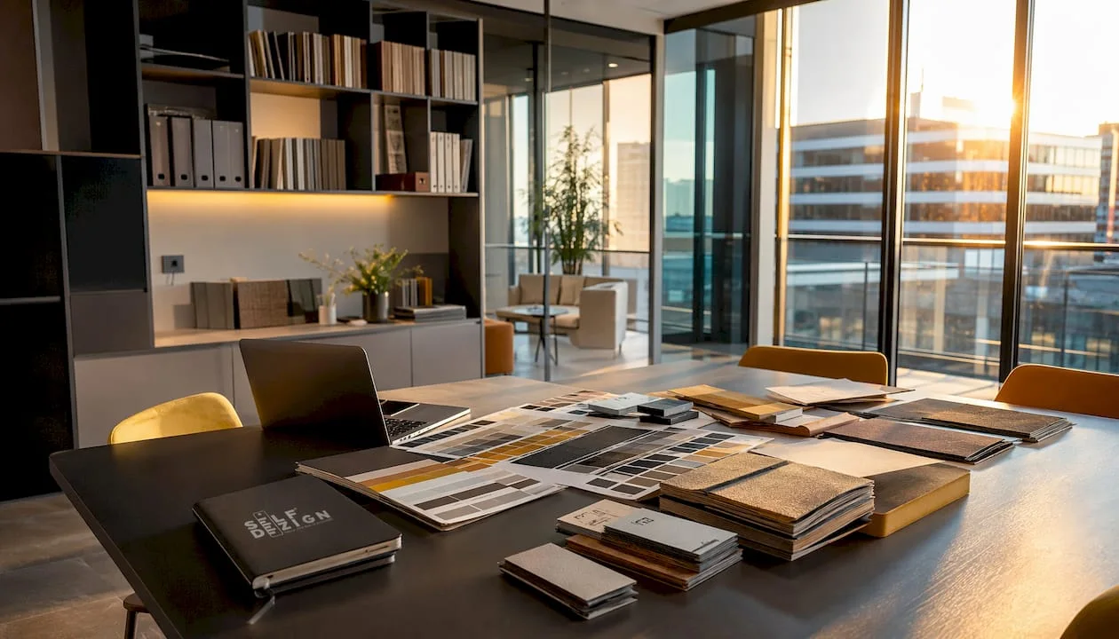
How Color Influences Customer Behavior in Commercial Spaces
Up to 93% of purchasing decisionsis based on visual appearance, and the brain processes color before any other element in space. The first 90 seconds spent in a store are decisive. The role of chromatics in commercial spaces is not decorative, but strategic: color shapes the mood, the pace of movement and the willingness to buy.
Some concrete effects that the well-chosen chromaticity produces:
- Warm tones(red, orange, yellow) increases heart rate and stimulates quick decisions, useful in promotional areas or at the house.
- Cold tones(blue, green, purple) calmly induce and extend the time spent in the space, suitable for showrooms or consulting areas.
- The dominant neutral(white, gray, beige) provides the background on which products become protagonists, without competing with them.
- Excessive saturationtires the eye in less than 20 minutes and increases the abandonment rate of the space.
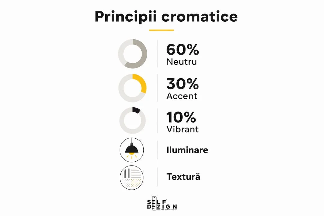
Principiul 60-30-10is the starting point for any balanced color scheme: 60% dominant neutral tone, 30% secondary color that adds depth, 10% accent that directs the gaze. This proportion prevents visual fatigue and maintains ambient coherence without flattening the space.
What color psychology says about purchasing decisions
Colors are not neutral. Each nuance activates emotional associations that, in a commercial context, translate directly into behavior. Understanding this mechanism is what separates an aesthetically arranged space from one designed to work.
Here's how the main colors work in retail:
- Redsignals emergency and energy. It works in areas of promotions and discounts, but used in excess creates anxiety.Boosts impulsive shoppingand is effective in short time windows.
- Albastrulinspires confidence and calm, which is whybanks and pharmaciesi use it systematically. It's not recommended in areas where you want quick decisions.
- Galbenulattracts attention faster than any other color. Reductions written on a yellow background are not a random convention, but a response to how the human eye ranks visual stimuli.
- Verdelecommunicates naturalness, health and balance. Works well in wellness spaces, natural food, or sustainable products.
- Portocaliulcombines the energy of red with the accessibility of yellow, creating a friendly and dynamic atmosphere, suitable for mass retail.
An aspect often ignored: the perception of colors varies depending on the culture and context. White communicates purity in Central Europe, but in other cultures it can signify mourning. Any project with an international audience must take this variable into account. The link betweencolor psychology and conversionsis consistently documented in the marketing literature, precisely because emotional reactions to color are partially universal, partially cultural.
Professional advice: Lighting does not support chromaticity, it defines it. A wall painted warm white under a source with a low CRI will look yellowish and cheap. Choose sources with high CRI and check the R9 and Rf indices for accurate rendering of saturated colors, especially red and orange.
How to combine colors efficiently in a commercial space
The 60-30-10 rule is more than a formula for walls. Applied correctly, it structures the entire visual vocabulary of a space: finishes, furniture, textiles, accessories and lighting. Experienced designers also extend it to furniture volumetry, not just color, achieving cohesion without monotony.
Some practical principles for combining chromatics in stores and commercial spaces:
- Sets the hierarchy from the beginning.You decide which element is dominant, which supports and which attracts attention. Without this order, the space becomes visually noisy.
- Use contrast intentionally.A product on a neutral shelf stands out. The same product on a colored shelf competes with the background and loses.
- Avoid more than three active colors at a time.Each additional color fragments the attention and reduces the impact of each.
- Vary the finishes, not necessarily the colors.The same matte and glossy tone creates depth without overloading the palette.
- Adapts the palette to the type of space.A fast-rotating restaurant benefits from warm and stimulating tones. A premium furniture showroom works better with sophisticated neutral and punctual accents.
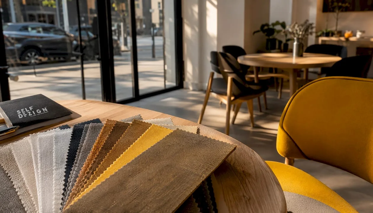
The contrast and texture in the interior design of the stores increase the time spent in the space and the value of sales. It's not about more color, but about color put in the right relationship with shape and light. You can also deepen the logic of these choices inthe practical guide to chromaticspublished by SelfDezign.
Why the color scheme must reflect the brand identity
Color is the first message a business space sends before someone reads a text or touches a product. Color consistencyincrease brand recognitionup to 80% and strengthens consumer confidence over time. Frequent pallet changes confuse customers and dilute the perceived brand value.
A few points worth paying attention to:
- Brand positioning is read in color.Dark tones and noble materials communicate luxury. Vivid and contrasting colors suggest accessibility and energy. Green and natural materials convey sustainability.
- Chromatics must be integrated into all elements of the space, not just on the walls: staff uniforms, packaging, signage, showcase and promotional materials must speak the same visual language.
- The audience influences the palette.A space for young people can support more saturated accents and bolder contrasts. A space for a mature or professional clientele gains in refinement and chromatic sobriety.
Alignment betweenvisual identity and layoutis not a finishing detail. It is the structure on which the customer experience is built from the first contact until the decision to return.
How SelfDezign integrates color in commercial projects
In SelfDezign, the color is not chosen according to the trend of the season. It is chosen after they have to make the space: sell faster, retain more, communicate a certain level of quality or reduce the friction of the purchase decision.
The process starts with understanding the real context of the project:
- Who is the end customerand what expectations it brings to the space.
- What is the concrete commercial objective: fast rotation, long consultancy, premium experience or perceived accessibility.
- What message does the brand conveyand whether the current palette supports it or contradicts it.
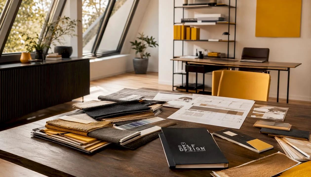
The 60-30-10 rule is integrated in the design not only at the color level, but also volumetrically: the proportions of the furniture, the visual weight of the textures and the distribution of the light sources follow the same equilibrium logic. Lighting is treated as part of the color scheme, not as a separate layer. A source with an inappropriate CRI can completely negate the effect of a carefully constructed vane.
SelfDezign avoids standard formulas precisely because a commercial space is not a catalog product. Each project has a specific stake, and the chromatics must serve it. The result is not a “nice” space, but a space that works for the customer's long-term goals.
Do you design a commercial space and want every chromatic decision to make sense?
SelfDezign works with entrepreneurs and management teams in Central Europe who understand that interior design is not an aesthetic cost, but a business decision. The difference from a standard layout is that every choice of color, texture, and light is justified by the actual objectives of the space, not by visual preferences of the moment.
If you want a commercial space where color supports the brand, guides the customer and contributes to measurable results, the SelfDezign team can build that concept from scratch, frominterior design strategyuntil the coordination of the implementation. Write to us and we'll discuss your project.