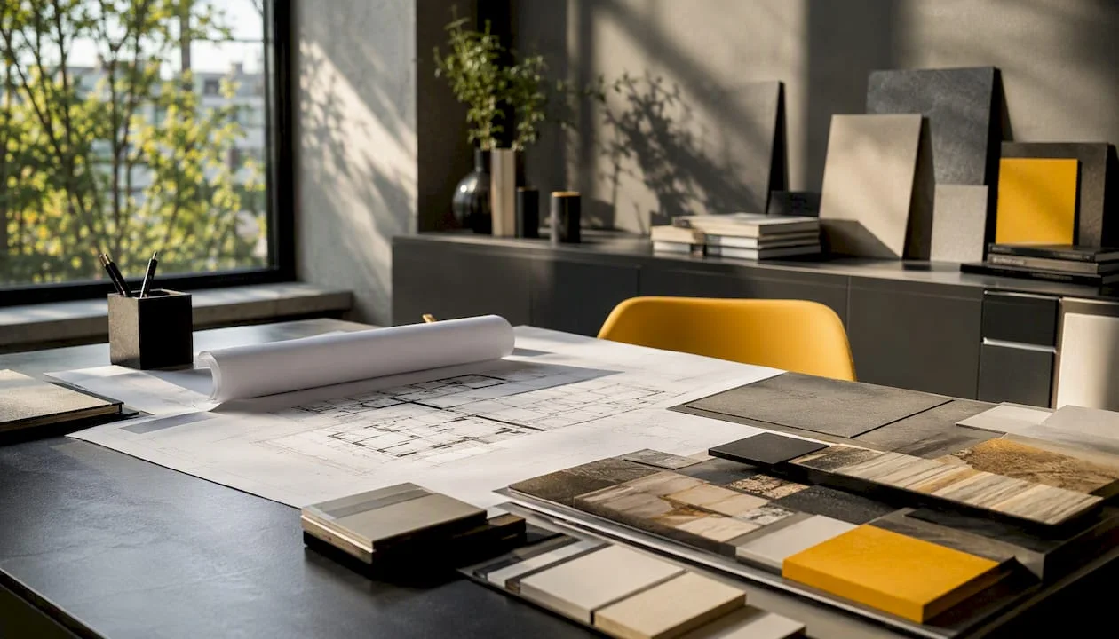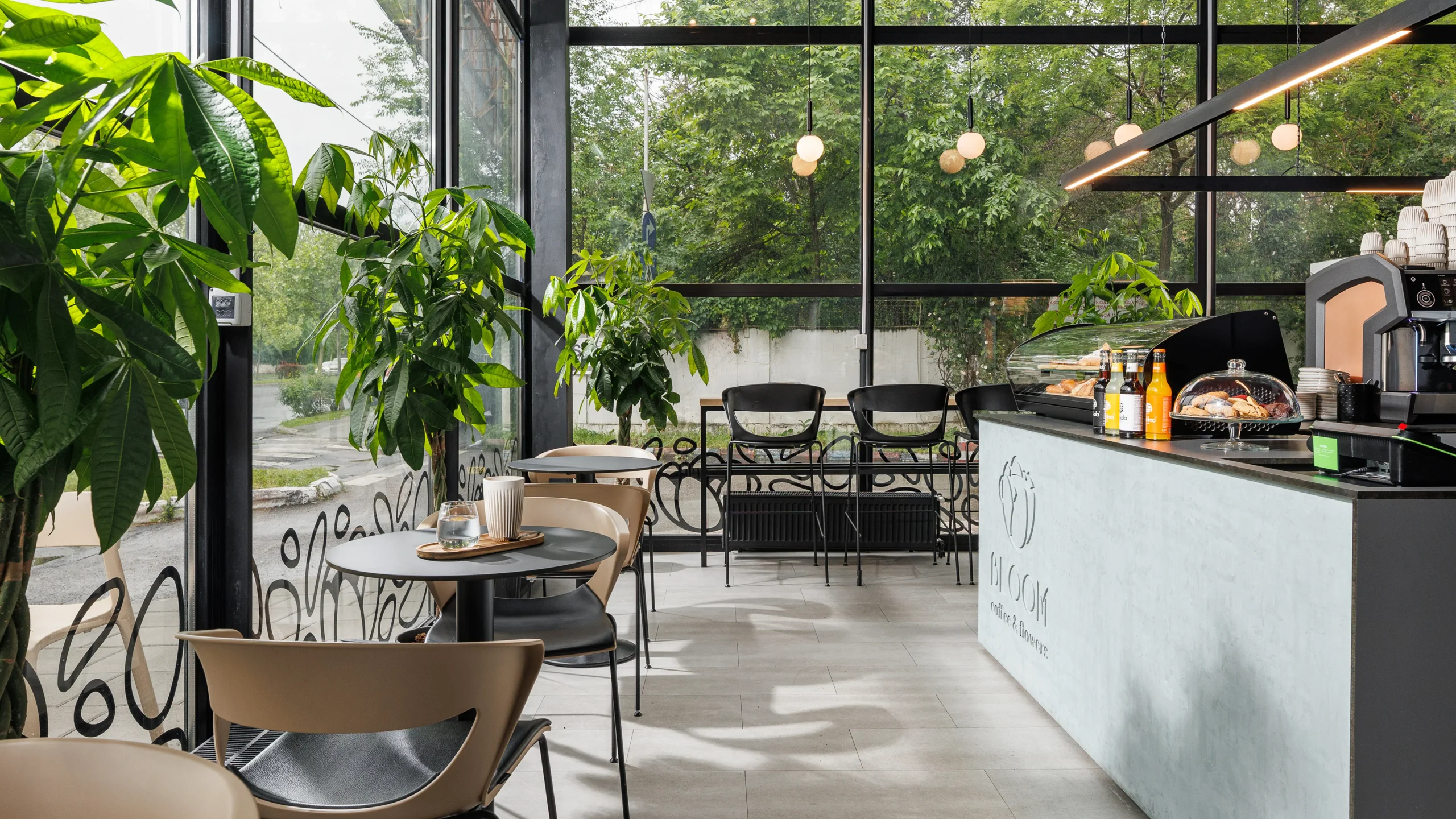

There is a common confusion in briefs: the client wants a space "that reflects the brand." That sounds good. In practice, though, it translates almost automatically into a logo on the wall, colors from the visual identity manual applied to surfaces, and a few product photos framed in strategic spots.
For more on choosing between custom design and trends, read our article Custom design vs. trends: how to choose the right way.
The result looks consistent. It rarely works.
A space that truly supports a brand's identity does something else: it translates that brand's values into design decisions. The circulation flow, the choice of materials, the way light changes throughout the day, the balance between private and open areas, the texture of the surfaces you touch, the acoustic warmth of the room. All of these communicate something, even if nobody planned it explicitly.
Adaptive branding in interior design is not a marketing concept. It is a design method.
The problem with applying visual identity directly to a space
A brand's visual identity manual is built for two-dimensional surfaces: screens, print, packaging. The colors are calibrated for displays, not for how light behaves on matte paint or exposed concrete. The fonts are designed for legibility, not for wayfinding signage in a physical space.
When you transfer a visual identity manual directly into a physical space, there is a good chance you end up with something that looks like a presentation concept. Everything is in its place. Nothing breathes.
The deeper problem is that the visual identity manual describes how a brand looks, not what the space needs to make possible. And a space has jobs a logo does not: handling the flow of 120 people at lunch, supporting a switch from daytime coffee to evening cocktails, offering privacy without blocking visibility, being easy to clean and hard to wear down.
What "adaptive" means in designing for brands
Adaptive branding in interior design starts from a different question than the usual one. Not "what does the brand look like?" but "what does the space need to do so the brand is lived, not just seen?"
There are a few concrete dimensions through which this works.
1. The space reflects the brand's values, not just its aesthetics
A brand that positions itself on transparency and open access, but whose space has a high reception desk, a heavy door and a mandatory security checkpoint, sends a contradictory message. People do not necessarily put the contradiction into words, but they feel it.
By comparison, Ace Hotel has built an understanding of this principle over 25 years. Each of the brand's properties looks different: the Shoreditch lobby (designed by Universal Design Studio) works as an extended public space, with modular furniture that can create "small rooms" inside the same room, suited to solo work, informal meetings or evening activations. The New Orleans lobby, Maison de la Luz, is ornate and explicitly rooted in the city's local context. The aesthetics are completely different. The core value is the same: the hotel as a hub of the local community, not a tourist capsule.
Kelly Sawdon, chief brand officer of Ace Hotel Group, described the principle in simple terms: "We are not after a uniform look. It is all about being ourselves in a specific building."
2. The space supports several moods, not just one
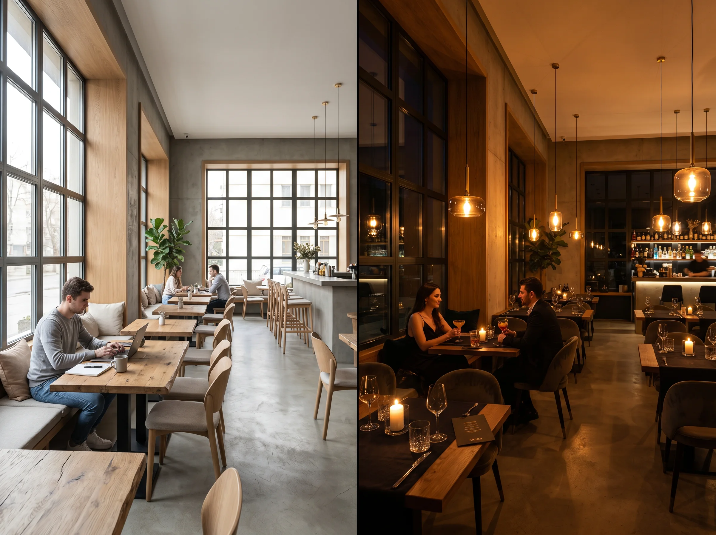
An F&B space that works well for morning coffee and evening wine does not have the same lighting, the same noise level or the same furniture layout at both times. It has a transition system designed on purpose.
Hospitality spaces that have solved this problem well usually rely on three tools: lighting on separate circuits with different color temperatures, furniture that can be repositioned fairly easily, and acoustic zoning that separates functions without isolating them visually.
Find out how strategic lighting can transform a space in Interior lighting guide: strategy and technique for perfect spaces.
This is not flexibility for its own sake. It is about designing an experience that changes coherently, instead of a space that seems not to know what it is.
3. Material details are brand statements
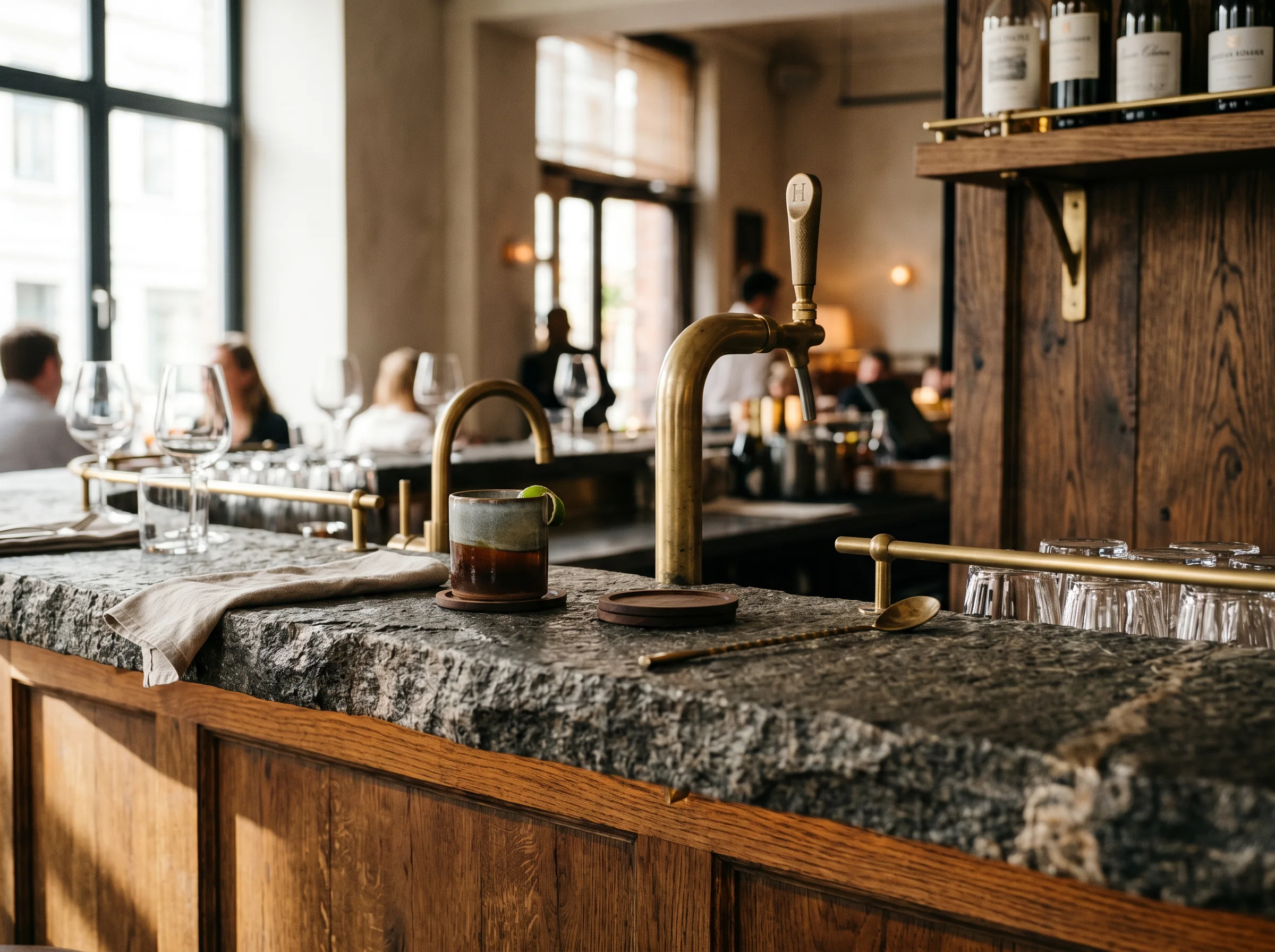
The materials you touch, the surfaces you hear (walking on hardwood versus concrete versus acoustic carpet), the texture of a bar top, the tactile temperature of a door handle: all of these communicate before anyone reads any brand copy.
A brand that communicates durability and longevity cannot use thin veneer on its joinery and furniture with joints visible from up close. One that says it values local craftsmanship cannot use standard imported surfaces with no nod to local character.
The coherence between what a brand says and what the materials in its space do is tested by every customer who walks in, even if nobody puts it into words.
The case of office spaces: a brand lived by the team, not presented to visitors
Office spaces have one distinctive trait compared with HoReCa or retail: the main audience is not the external customer, but the team.
Adaptive branding in offices works differently than in a café or a hotel. The people who work there see the space every day, for years. What looks spectacular in the first week becomes background. What remains is the quality of the basic experience: natural light, acoustics, thermal comfort, ease of wayfinding, whether the space allows focus and whether it allows collaboration without one undermining the other.
The American Society of Interior Designers (ASID) has documented that office design directly influences employee satisfaction, retention and perceived performance. The link between brand identity translated into space and team engagement is also confirmed in practice: when people work in a space that coherently reflects the company's values, they have a physical point of reference for what the organization stands for.
You do not get this with a logo on the entrance wall. You get it through design decisions that support how the team actually works: areas for real collaboration (not an open space that is declared open but is noisy and offers no visual privacy), focus areas that offer retreat without isolation, and shared spaces that encourage informal interaction.
The real tension: consistency versus local relevance
There is a tension that researchers at the University of Warwick have documented academically, and that any architect or designer working with multi-location brands knows in practice: a brand needs consistency to be recognized, but it needs local relevance to be authentic.
The study by Beverland, Wilner and Micheli (2015, Journal of the Academy of Marketing Science) describes this tension as "brand ambidexterity": a brand's ability to maintain consistency of identity and adaptability to context at the same time.
In interior design, resolving this tension in practice means identifying what is negotiable and what is not. For Ace Hotel, the fixed elements are the values (local community, authenticity, culture), not the aesthetics. The design of each property is fully negotiable, as long as it supports those values.
For a network of medical clinics, the fixed elements are standards of clarity, trust and smooth patient flow. The color palette, materials and aesthetic character can vary between locations, as long as the core experience stays recognizable.
The problem arises when the client confuses the fixed elements with the visual ones. Then you get surface consistency and experience inconsistency, which is exactly the opposite of what a well-designed space should do.
What happens when the space contradicts the brand
The 2009 Tropicana case is often cited in marketing as an example of a failed rebrand: the company changed its packaging without understanding which visual values the old one communicated, lost 20% of sales within a few weeks, and returned to the previous design in less than two months.
The same mechanism works in physical spaces, with one important difference: you cannot go back to the "previous design" in a few weeks. A poorly designed space, or one that contradicts the brand, costs a complete redo.
Concrete examples are not hard to find. A café that positions itself on community and as a place to work, but whose furniture is chosen to look good on Instagram, for example small tables, chairs that are uncomfortable for long stays, and lights aimed at surfaces rather than people, will attract a first visit and lose any reason for people to come back.
A showroom that communicates premium but uses finishing materials with tactile noise (surfaces that vibrate, visible joints, plastic handles) sends a contradictory message that the customer senses before processing any rational information.
How we approach adaptive branding at SelfDezign
When we work with a client in HoReCa or retail spaces, the first set of questions is not about aesthetics. It is about function: how people live the space, not how it looks.
What does the space make possible at 9 in the morning versus 9 in the evening? How many people can move through comfortably at peak hour? What is the minimum perceived privacy distance for a table for two versus a table for four? How do the acoustics change when the space is half full versus full? Where should the visual contrast that makes the space memorable go, without interfering with its main function?
Only once we know the answers to these questions can we translate brand identity into design decisions. Color does not come from the visual identity manual. It comes from how light behaves in the space at different hours. Material does not come from the trend of the year. It comes from what has to survive 200 people a day without losing what it communicates at first touch.
On the Cafeneaua Veche 9 project, we worked with exactly this logic: the space had to work at the same time as a morning coffee spot, a place to work at lunch and a fuller evening experience. Not three separate spaces. The same space, with three deliberately designed moods, each supporting what the brand promised at that moment.
What a space asks of a brand before you get a brief
If there is one thing we have learned working in HoReCa and retail spaces, it is this: a good brand brief for design is not the visual identity manual.
It is a clear description of the experience someone should have in the space, at a specific time of day, in concrete circumstances. Not "we want to convey warmth and authenticity." Rather, "when a customer walks in alone at lunch and opens a laptop, we want them to feel there is room for them without being disturbed, that they do not have to justify sitting alone at a table, and that they can come back just as easily in the evening with friends."
With a brief of that quality, designing the space becomes a problem of experience architecture. Without it, it remains a problem of decoration.
And over time, the brand pays for the difference between the two.