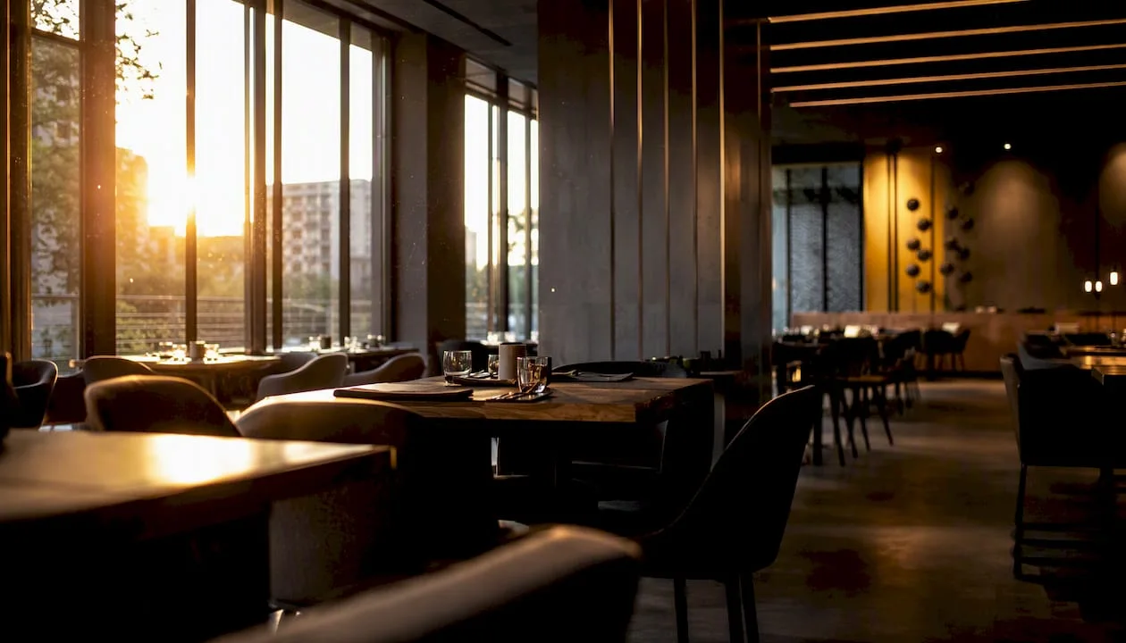
Small Store Layout: Which Layout Model Works Best
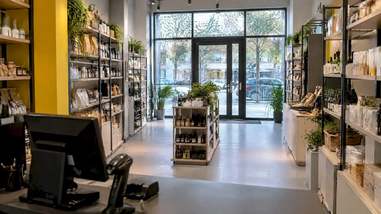
For most stores below 50 sqm, the grid model or a mixed variant that prioritizes a clear route and a visible counter offers the best commercial yield. The choice wins for two reasons: the flow remains predictable, and the staff immediately sees the problem areas. The final solution, however, adjusts by product category, because a clothing boutique does not behave like a grocery store.
In summary:
- The grid or mixed layout ensures a predictable flow and quick visibility of problem areas, being recommended for small stores under 50 sqm.
- The minimum aisle width must be at least 90 cm for comfortable circulation and 120 cm for the passage of two customers simultaneously, according to the rules for small spaces.
- Custom-made furniture is indicated for atypical or irregularly shaped spaces, while modular solutions are preferable for lower costs and flexibility.
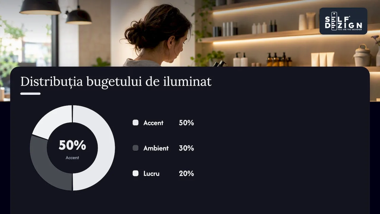
- For the exposure areas, the lighting must be layered, with 50% accent, 30% ambient and 20% task, with an intensity of 300–500 lux.
- The cost of a commercial interior design project for a small store varies between 25 and 55 euros per square meter, and punctual advice starts from 500 lei.
SelfDezign
Arrange the store according to the actual flow
SelfDezign designs customized commercial spaces, from the interior concept to the technical design and implementation coordination.
Layout types: grid, loop, linear, free flow and practical mixes
The choice of the base model influences everything that comes after, from the position of the cash register to the width of the aisles. Each of the four classic models has a context in which it becomes evidently the most appropriate.
Layout tip Grille organizes the shelves in parallel rows, perpendicular to the main route. It works well for small grocery stores or large, predictable assortments where the customer is searching efficiently and does not need visual discovery.
Layoutul loop (also called track) directs the customer on a circular route that runs through all areas of the store before reaching the checkout. It is useful in fashion boutiques or gift shops, where product discovery plays an important role in the purchase decision.
Layoutul liniar align the shelves along the walls with a central aisle. It fits into narrow, elongated spaces where there is no room for exposure islands.
Model of free flow discard the strict grid and distribute the furniture in organic groups. The advantage is the more personalized atmosphere, but it requires a surface generous enough not to block the traffic.
The full description of these models and their selection criteria for small grocery stores is detailed in a practical layout guide for grocery stores, especially useful when the assortment combines volume products with impulse products.
The decision criteria we check before any sketch:
- shape of the space: a narrow rectangular space favors the linear, not the loop;
- the available width of the main aisles;
- nature of the assortment: routine products versus discovery products;
- customer profile: rushed buyer versus shopper browsing.
In practice, many small stores arrive at a mix: grid for the volume area, short loop for the impulse area, close to home.
Zoning and flow: customer route and non-negotiable rules
The entrance area functions as a visual accommodation area, not as a place to store boxes or temporary stands. The customer needs a few seconds to orient before starting to walk through the districts, and an overcrowded entry cancels this effect, according to a guide to organizing the customer journeyement
Strategia Golden Triangle links the entrance, the top products window and the cash register in a coherent visual route. In a small space, this triangle compresses, but the principle remains: products with good margin or fast rotation stand on the natural path of the gaze, not hidden in a corner.
The width of the aisles is not an aesthetic detail but a functional constraint. The recommendation for small commercial spaces is a minimum of 90 cm for comfortable one-way circulation and a minimum of 120 cm where two customers must be able to meet without getting stuck, according to recommendations for commercial premises under 50 sqmement
Steps we follow when checking a route on the drawing:
- mark the accommodation area at the entrance and check that it does not intersect the access door;
- we trace the main route home and identify the narrowing points below the minimum width;
- we check the visibility of the cash register from any point of the store;
- we simulate the passage of two customers to the narrowest point of the route.
Professional advice: mark the actual width of the aisles on the floor with duct tape before you buy the furniture, not after.
Furniture and exposure: solutions that save inches and increase sales
The choice between modular furniture and bespoke furniture depends on how atypical the space is. Where walls have irregular angles, columns or niches, custom-made furniture capitalizes on every centimeter; otherwise, modular solutions offer greater flexibility and lower costs, according to the same source on commercial spaces below 50 sqm.
Solutions that make a real difference in a small store:
- wall-mounted shelves, which release the floor surface for circulation;
- low gondolas in the central area, so as not to visually block the rest of the store;
- compact counter with integrated storage underneath, which eliminates the need for a separate warehouse for daily supplies;
- self-lit showcases for premium products, positioned on the main visual route.
For the category of showcases and display solutions, the achievements of professional showcases illustrates how a well-proportioned display case can change the perception of a top product.
Finishes matter as much as the shape of the furniture. Washable surfaces without porosity reduce daily maintenance time, which is essential in a store with constant traffic and low staff. We avoid materials that retain visible dust or that scratch easily in areas of frequent contact, such as the edges of the entrance shelves.
Lighting and atmosphere: practical parameters and solutions for highlighted products
Lighting in a small shop should be thought of in layers, not as a single general source. Recommended light budget split is about 50% accent, 30% ambient and 20% task, a proportion that supports both the visibility of the products and the visual comfort of the staff, as recommended for spaces below 50 sqm. Basically, this means that most of the light budget goes to the products we want to see the customer, not the ceiling.
At the exposure plane level, the useful range is 300 to 500 lux, enough to highlight the texture and color of the products without creating disturbing reflections. Color temperature influences the perception of materials: warm tones for textiles and craft products, more neutral tones for electronics or technical products.
Flexible solutions we recommend in limited budget projects:
- track lighting systems, which allow repositioning of luminaires as exposure changes;
- dimmers for ambient light, useful to adapt the atmosphere between day and evening hours;
- orientable accent spotlights, directed at an angle that avoids harsh shadows on the product.
For a technical breakdown of light layering and color temperature, the complete guide to indoor lighting types provides a useful starting point.
Materials, colours and finishes: how to choose for a feeling of space and durability
A small space seems more generous when surfaces reflect light instead of absorbing it. The walls in clear tones, the glossy floors in moderation and the shelves in matt but bright finish create the impression of breathing, without the need for extra square meters.
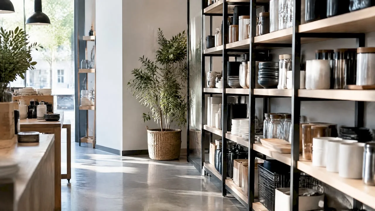
The color palette is chosen by the category of products, not by personal preference. A fashion boutique tolerates strong color accents on a neutral background; a gift shop works well with warm tones that suggest comfort; household products sell better on a discreet background that does not compete visually with the object.
Recommended materials for heavy traffic and easy maintenance:
- vinyl flooring or matte tiles, scratch-resistant and easy to wash;
- laminated or compact counter tops, without dust retaining joints;
- washable wall paints, especially in the entrance area where contact is frequent.
For finishes on interior doors or wooden partitions, the typologies explained by interior door finishes provides useful benchmarks for choosing a durable and consistent finish with the rest of the store.
Step-by-step implementation: measurements, mock-up, tests and final checklist
Moving from sketch to actual store works best when each stage is validated before investing in final furniture production.
- Accurate space measurements, including the position of doors, sockets, columns and any fixed element that cannot be moved.
- 1:1 scale mock-up, using adhesive tape on the floor or temporary furniture, to see the real route, not just the one in the plan.
- Real Scenario Testing: we simulate two or three customers circulating simultaneously, a delivery of goods and a queue at the cash register, to identify bottlenecks before they appear at the opening, according to the observations on merchandising simulations in merchandising techniques in a storeement
- Final fitting of furniture, after the route and zoning passed the mock-up test without major adjustments.
Digital 2D planogram and simulation tools can accelerate this step, especially when the space has atypical shapes; a review of the options can be found in the guide about software for designing commercial spacesement
The final checklist before opening checks, among other things, the visibility of the cash register from any point, the width of the aisles in critical areas, unobstructed access to the emergency exit and the full operation of the lighting layering. A broader checklist, applicable to any retail project, is available in retail fit-out checklistement
SelfDesign Perspectives: Synthetic Examples and What to Ask of a Designer
We often work in small commercial spaces where the real challenge is not aesthetics, but the balance between exposure, circulation and the work area of the staff. A typical example: a 30 sqm store with a single counter visually blocked by an entrance stand. The design decision was the relocation of the counter on the diagonal opposite to the entrance and the elimination of the stand, in order to free the accommodation area. The estimated result was a 40 cm wider route at the critical point, sufficient for the simultaneous passage of two customers without blockage.
Our services of commercial interior design covers exactly this type of intervention, from the visual concept to the technical project.
Before a first consultation, it is useful to prepare a plan of the space (even indicative), a few photos from different angles and an estimated budget for furniture and execution. The concrete steps of the consulting process are described in guide to commercial interior design consultingement
Toni
Signage and visual communication in small spaces
The signage in a small shop has only one mission: to reduce the orientation effort without adding visual noise. A clear input panel with the name of the main categories relieves the customer of the need to look for staff for simple questions.
Price tags and shelf information work best when they have a consistent typographical hierarchy: product name visible from a distance, price more discreet but readable. Signage materials must harmonize with the color palette of the store, not introduce an accidental contrast.
In showcases, short messages, limited to a single idea on the poster, perform better than long texts, because the attention time to the showcase is short. Targeting areas of interest (promotions, news, categories) is done by suspended signage or on the floor, not by stands that occupy the width of the aisle.
Optimizing the customer experience in small stores
The experience in a small store is built from details that individually seem minor: the distance between the shelves, the ease of getting to the house, the clarity with which the products are grouped by categories. The amount of these details decides whether a customer returns or not.
A route that does not force the customer to turn away reduces frustration, just like a cash register visible from any point of the store. Staff also play a role in the experience: a counter positioned so the seller can observe the entire room supports quick intervention when a customer needs help.
The test or sample areas, where the assortment justifies them, must be visually separated from the rest of the route in order not to create blockages. In a small space, each layout decision has a direct effect on the time spent in the store and on the comfort with which the customer goes through the assortment.
When a designer deserves it vs. DIY solutions for small boutiques
The decision depends on three practical factors: the estimated traffic, the complexity of the assortment and the storage needs. A store with simple assortment and regular space can work with a well-documented DIY sketch. An atypical space with high traffic or hidden storage needs benefits visibly from a professional look, because zoning errors cost more after installation than before.
Investing in a design project directly influences customer experience and daily operational fluidity. For those who want a quick check before deciding, a mini-space audit or one-off consulting session provides clarity without major commitment.
How SelfDezign can help you for a small store
For a store under 50 sqm, we offer design services covering visual concept and technical design, with coordination of execution to ensure consistency in layout, lighting and furniture decisions. Commercial interior design service is charged per square meter and fits projects that need an integrated solution, not just punctual advice.
For those who just want a clear direction without a complete project, we offer consultancy with written conclusions, with a concrete deliverable at the end of the session. For owners who are not in Bucharest or prefer a remote collaboration, the package SelfDezign Remote for HORECA PROJECTS can also be adapted to discussions about small commercial spaces consulted remotely.
Before the first contact, it is useful to have at hand a sketch or a plan of the space, some photos and an indicative budget for furniture and execution. From here, the next steps are set together, depending on the complexity of the project.