Shop Customer Orientation: How to Guide Circulation and Increase Sales
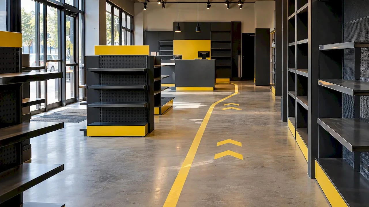
Customer orientation in the store means the deliberate design of traffic, signage and layout to reduce friction and increase the visibility of products. A clear route means better flow, more visible products, and faster buying decisions. The recommendations below are based on specialized studies and SelfDezign's experience in designing commercial spaces.
In summary:
- The positioning of the orientation signs must be at heights between 2.56 and 2.75 meters or between 3.12 and 3.31 meters to be effortlessly visible.
- Placing fast-rotating products at eye level and impulse items close to critical nodes maximizes sales and purchasing decisions.
- Signage for all visitors must use strong contrasts and universal symbols, including tactile and audio variants for true accessibility.
- The layout testing is done through paper simulations, traffic measurements and observations, before investing in signage or furniture.
- Consultancy and design services are available from SelfDezign, for rapid diagnosis or complete implementations with technical design and coordination on site.
SelfDezign
selfdezign.ro
Design a store that's easy to navigate
SelfDezign creates customized commercial spaces, from concept and technical design to implementation coordination.
Principles that make a difference in a commercial space
Effective orientation does not happen by chance. It builds on a few verified rules, consistently applied throughout the space.
The position of the signs matters as much as their message. A study conducted on an underground shopping street identified height ranges with high visual salience, between 2.56 and 2.75 meters and between 3.12 and 3.31 meters, areas where the gaze is naturally fixed, without conscious effort. Below these thresholds, the signs get lost in the visual noise of the shelves and other customers.
Equally important are the critical nodes: the entrance, the intersections between the aisles, the stairs or the elevator area. There the customer decides the direction, so the information must be complete exactly at that point, not two meters away.
- Place orientation signage at decision points, not just at the main entrance.
- Keep a balance between symmetry and asymmetry so that the visitor quickly forms a mental map of the space.
- Clearly separate the guiding signage from the promotional signage so that the two messages do not cancel each other out.
- Repeat the major visual landmarks at regular intervals, not just once.
Professional advice: test the height of the signs with a person of average stature before final assembly, not just from sketches.
The difference between guiding and promotional signage deserves to be dealt with separately in the brand strategy, as we explained in the guide to sensory branding in commercial spacesement
Layout and circulation: how to organize your route in a small or medium store
A well-targeted store has an obvious main route and secondary routes that do not compete with it for attention. The main route takes the customer through high-margin areas, while the secondary routes allow exploration without blocking the overall flow.
A few layout decisions have a direct impact on sales:
- Place the products with fast rotation and good margin at eye level, on the route with constant traffic.
- Place impulse items near critical nodes, where the customer already stops to decide.
- Manage vertical traffic carefully: the stairs and elevator directly influence the commercial value of the upper floors, according to a spatial structure analysis in shopping centers, which shows that the connectivity of the plan determines the pedestrian flow distribution.
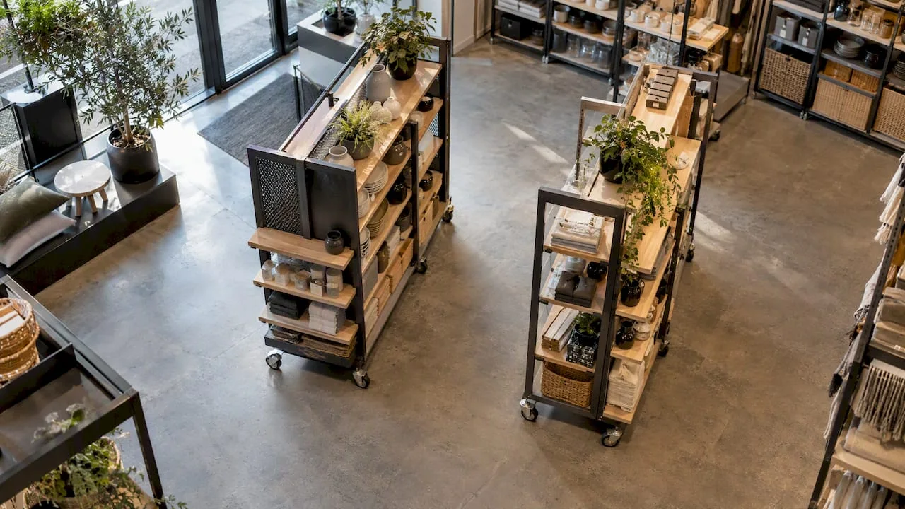
- Use modular furniture for shelving and gondolas, so you can quickly test arrangement variants without high costs.
- Regularly check that secondary routes do not create bottlenecks during peak hours.
A practical example: in a store of 150 square meters, moving a gondola from the middle of the main aisle to a secondary node can free up the central flow and increase the time spent in the side areas without any investment in new signage. The basic principles of this type of intervention are detailed in the practical guide to interior design for commercial spacesement
Modular furniture has an advantage that few retailers exploit: it allows fast seasonal rotations without complete redesign.
Inclusive signage: how you guide all visitors, not just most
Good signage works for everyone, not just the typical customer. Color contrast, readable font, and universal symbols are the starting point, but true accessibility demands more.
- Use strong contrast between text and background, no-serif fonts, and short messages of no more than a few words.
- Include touch maps and Braille indications at major decision points, not just at the main entrance.
- Consider audible signals for areas with heavy traffic or complex configuration.
- Integrate digital solutions such as NaviLens, a digital signage system that provides audio and visual information to visually impaired people and that can be detected from distances greater than a regular QR code.
Relevant study: the research on the visual layout of the guiding signs confirms that the position and height of the signs directly influence how quickly a visitor observes them, regardless of the type of commercial space. Basically, a properly placed signage saves the visitor the effort of actively searching for information.
Discreet integration of affordable solutions into the visual identity of the brand is not an aesthetic compromise. The reconstruction project of the Origo shopping center in Riga shows how the ramps, tactile guidance and automatic gates can be naturally integrated into the architecture of a modern commercial space, without appearing as elements added later.
How to test and measure the impact of pre- and post-implementation guidance
Validating an orientation plan does not require expensive equipment. The paper simulation, with blockage scenarios and alternative routes marked on the store plan, detects obvious problems that could be skipped on a quick visual inspection.
- Mark the probable blocking points on the plane and test at least two alternative routes.
- Collect real data through video observation, incoming traffic counters and their correlation with sales per square meter.
- Use mobile eye-tracking only when the decision has a high financial impact, because such a test in crowded stations or spaces clearly shows that the signs work best when they are in the direct field of vision and when the visitor density is low; in crowded places, people tend to follow the crowd, not hands.
- Establish monitoring thresholds: sales per square meter, stock rotation and average visit duration, checked monthly.
Professional advice: run the paper simulation test before any physical change, then compare the result with the actual observation from the first week of traffic.
Quick Checklist for a Store Orientation Pilot
A well-structured pilot does not require months of training, but a clear audit and priorities set from the beginning.
- Do an initial audit: measure current routes, observe customer behavior, and mark critical nodes.
- Set priorities for immediate interventions, starting with signage at decision points and main routes.
- Plan a prototype with temporary markings, tested during peak hours, before investing in permanent signage.
- Clearly define roles: design team for concept, execution team for erection, a responsible for checking results.
- Document the deliverables of each step, from the initial outline to the post-implementation observation report.
The above steps complement the logic in the complete retail space layout checklist, useful for those preparing a larger renovation.
SelfDezign perspective on customer orientation
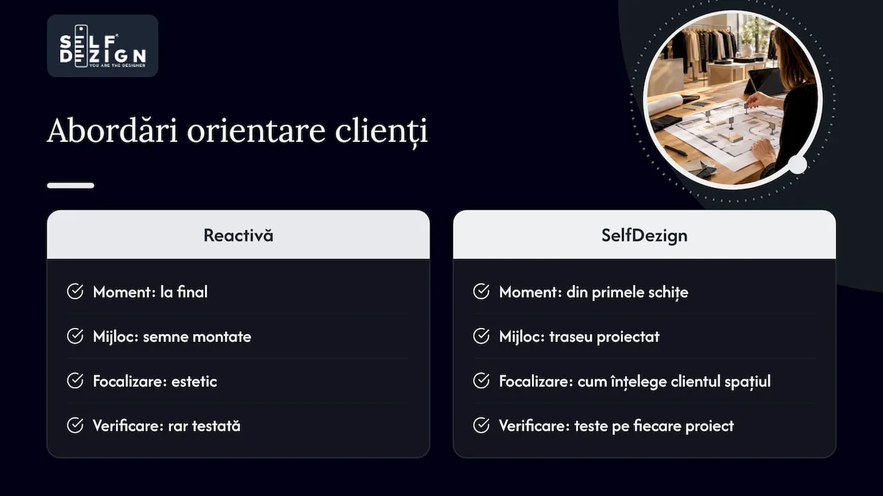
Orientation is not an aesthetic layer added at the end, but a design decision taken from the first sketches. At SelfDezign we look at each route as a direct consequence of how the customer understands the space, not as a list of signs mounted later.
The difference between a store that “looks good” and one that really guides the customer lies in verifiable details: where the gaze stops, where blockages are created, where the right product reaches or does not reach the buyer's visual range. Actual customization comes from testing these details on each project, not from applying a standard formula.
Toni
How SelfDezign can help you implement effective guidance
A good customer orientation is not solved by a list of signs bought separately, but by a coherent concept, thought together with the real circulation of the space. SelfDezign proposes exactly this type of approach: design that starts from the concrete needs of your business, not from a quickly applied template.
For complete commercial projects, the team offers Commercial Interior Design, with concept, technical design and coordination of execution on site. For situations where you only need a clear diagnosis before deciding the investment, Consultancy with written conclusions provides an applicable report with documented recommendations.
- For a complete commercial project, from concept to execution, choose the commercial interior design service.
- For a quick diagnosis of the current layout, one consultation session with written conclusions is sufficient.
- For investors or owners in the diaspora with HORECA projects, SelfDezign Remote provides remote consultancy without travel.
You can learn more about the process in commercial interior design consulting guide or you can directly request a discussion via the services page.