Clinic signage and wayfinding: a design guide
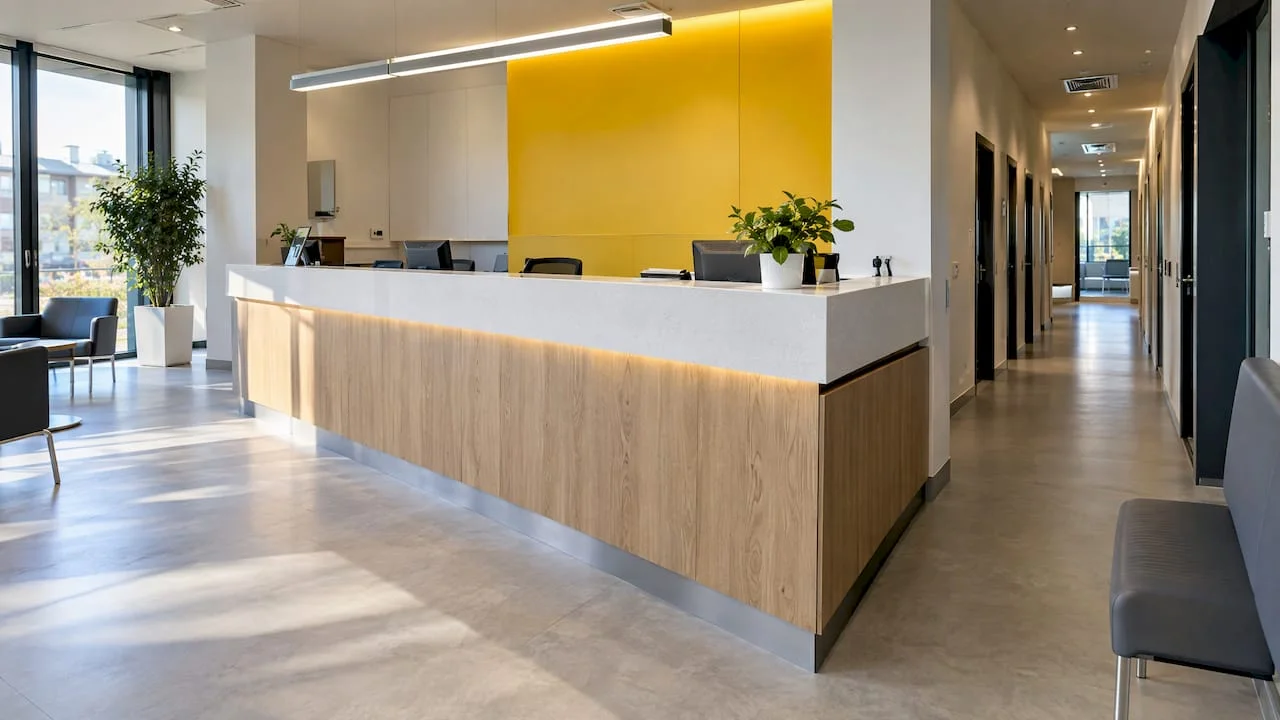
In a well-planned clinic, patients never wonder where to go. They reach reception, sit in the right waiting area and find the consulting room without stopping anyone in the corridor. For that to work, signage cannot be ordered at the end, like a set of plaques stuck on doors. It is part of the interior project: of how the entrance, reception, circulation routes and colours are laid out. This is why signage and the wayfinding system stay coherent when they are designed together with the space, by the same team that understands the clinic's flows. Below you will find what a wayfinding system means in practice, which signs you need, how to plan the routes and what the Romanian accessibility norm says.
In short
- Wayfinding is more than signs. It is the relationship between the patient and the space: architecture, light, colour, naming and signs work together to reduce the stress of a person who arrives already worried.
- A good system starts from the decision points. Every place where the patient must choose a direction gets exactly the information needed there, no more and no less.
- Accessibility is part of the project from the start. The NP 051-2012 norm applies to the design of buildings of public interest and use, including polyclinics and dispensaries. Among other things, it requires clear visual information at evacuation exits and the established symbols at the adapted toilet.
- Signage must speak the language of the brand. Integrated into the interior concept, it builds trust; added later, it looks like a set of repairs.
- Test before you produce everything. Graphic elements are checked first in a small area and adjusted before they are applied across the whole clinic.
Why orientation matters in a clinic
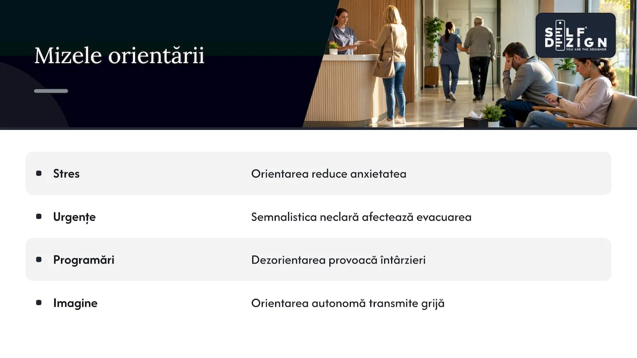
A patient entering a clinic is not an ordinary visitor. They may be worried about a diagnosis, may be accompanied by a restless child or an elderly parent, and may be late for the appointment. In this state, every hesitation at a corridor junction turns into tension.
The international guidelines for healthcare facilities define wayfinding as the dynamic relationship between people and space. They note that a poor orientation system increases patients' anxiety, while understanding and control of the space reduce it.
The stakes are not only comfort. The NHS Estates guide on wayfinding (2005 edition, written for healthcare facilities in England) shows that disorientation uses up staff time and makes patients late for appointments. The international guidelines add that a weak system can affect safety, especially in emergencies. For a private clinic, where every slot in the diary has a value, reception staff who explain the way and late arrivals are felt directly in the schedule.
There is also an image stake. The first impression of a clinic's professionalism forms before the consultation: at the entrance, at reception, in the corridor. A space where patients find their own way conveys order and care. One full of A4 sheets stuck up with tape conveys improvisation, however good the medical team is.
Signage and wayfinding: what is the difference
The two terms are often used as synonyms, but they do not mean the same thing. A simple comparison: signage is the vocabulary, wayfinding is the whole speech.
|
Element |
What it is |
Example in a clinic |
|---|---|---|
|
Signage |
The set of physical or digital signs |
The plaque "Room 3, Cardiology", the arrow to the laboratory |
|
Wayfinding |
The complete system that helps people find their way |
Obvious entrance, reception visible from the door, colours by zone, consistent names, signs at junctions |
|
Visual identity |
The graphic language of the brand |
The font, the palette, the clinic's own pictograms |
|
Pre-visit information |
What the patient learns before arriving |
Directions in the confirmation message, the map on the website |
The international guidelines divide signs into static and dynamic. Dynamic signs are usually electronic and suit places where information changes often. The same guidelines give a wayfinding system four roles: identifying services, controlling pedestrian and vehicle circulation, separating public areas from staff areas, and reducing safety and health risks. And the NHS guide shows that environmental factors, such as clearly defined routes and architecturally prominent entrances, need the same attention as signs.
The practical conclusion: if the corridor is confusing, no sign fully repairs it. Orientation is solved first through the plan of the space, then through signs.
Which signs you need, from entrance to exit
Think of the patient's route as a story with a beginning, a middle and an end. Each stage needs a different type of message.
|
Zone |
Type of sign |
What it must communicate |
|---|---|---|
|
Exterior and car park |
Identification sign, direction to the entrance |
The clinic's name, the main entrance, access for people with disabilities |
|
Entrance |
General plan or orientation panel |
Which services are in the building and on which floor |
|
Reception |
Clear identification, possibly a call screen |
Where check-in is, what comes next |
|
Waiting areas |
Identification by specialty |
Which area to wait in for your service |
|
Corridors and junctions |
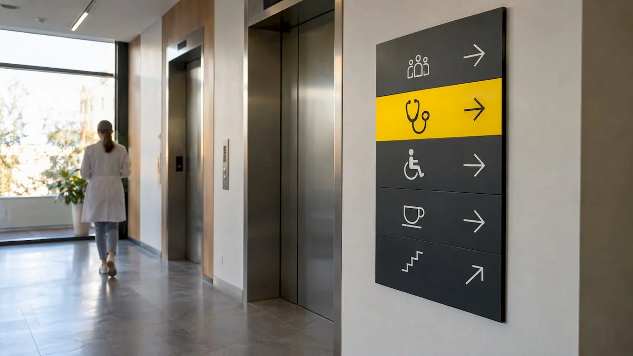
Directional signs |
Arrows to consulting rooms, laboratory, toilets, lifts, stairs |
|
Consulting rooms and treatment rooms |
Identification sign at the door |
Number, specialty, possibly status (occupied, free) |
|
Restricted-access areas |
Regulatory signs |
"Staff only", sterile areas |
|
Exits |
Evacuation and exit signs |
The way out in any situation |
A few observations from design practice:
- Hierarchy matters. A panel at the entrance shows the whole clinic; a sign in the corridor shows only the next decision; the plaque at the door confirms you have arrived. If you load them all with the same amount of information, the patient stops reading any of them.
- Naming must be consistent. If the website says "Imaging", reception says "Radiology" and the door says "X-ray", the patient has three names for the same place. Choose one term and use it everywhere.
- Separate the circulation routes clearly. Patient areas and staff areas must be easy to tell apart, which also helps with privacy in medical clinics, a subject that signage can support or undermine. For the routes between zones, see our guide to functional circulation routes in a clinic.
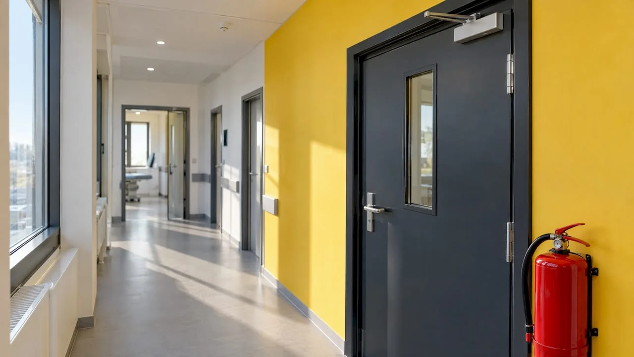
- Evacuation signs are not negotiable on aesthetic grounds. They are integrated into the concept, but they are not hidden or stylised until they become hard to recognise. Their form and locations are confirmed with the fire safety designer and the fire inspectorate (ISU).
How to plan the routes, step by step
The order below adapts to a clinic the stages in the NHS guide for wayfinding projects: audit, strategy, solutions, evaluation and maintenance.
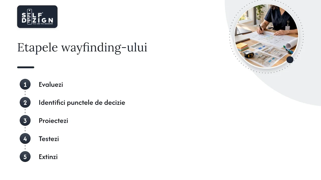
1. Audit of the space and the flows
You start with the question "who comes, from where, and where must they get to?". You note the patient categories, the specialties, the peak hours, and the routes of staff and materials. If the clinic already exists, you watch where people stop to ask: those are the real problems.
The common mistake is to jump straight to graphics. Without an audit, you end up putting well-drawn arrows on a route that should not exist. In our projects for interior design for medical clinics, this stage is part of understanding the clinic's real context and goals, before any aesthetic choice.
2. Identifying the decision points
A decision point is any place where the patient must choose: the entrance, the exit from the lift, a fork in the corridor, the end of a waiting area. The NHS guide asks you to identify the key decision points and the information needed at each, as the basis of the strategy.
A small clinic may have fewer decision points than you think, if the plan is well made. Every decision point removed through architecture is one sign you no longer need.
3. Coordinating with the information before the visit
Orientation starts at home. The NHS guide asks that appointment letters, maps sent in advance and directions given by staff use the same terms as the signs. If the SMS says "floor 2, Paediatrics", the panel at the lift must say exactly "Floor 2, Paediatrics", not "Children's department".
4. Designing the graphic system
Only now do you decide the font, pictograms, colours, materials, dimensions and positions. Signage gets its own volume in the technical project: plans with the position of every sign, detail drawings, fixings, lighting. When the interior concept and the technical design are done by the same team, the signs do not compete with the finishes but build on them.
5. Testing in place
The recommended process includes testing the graphic elements in real conditions and refining them before applying them across the whole site. In practice: full-size 1:1 mock-ups, stuck up temporarily, checked from reading distance, in the real light of the space, by people who do not know the clinic.
6. Production and installation
Most deviations happen on site: a sign moved because a socket ended up there, a plaque fixed higher because it "looked better". The coordination of implementation on site, which we provide in our projects, means that every element ends up where the project intended and fits the rest of the fit-out.
7. Maintenance and updating
Clinics change: a new specialty appears, a room changes its use. The system must be modular, so that one sign can be replaced without redoing the whole corridor. Appoint an internal person who checks regularly whether the messages still match reality.
Legibility, contrast and accessibility
In Romania, the main reference is the NP 051-2012 norm on adapting civil buildings and urban space to the individual needs of people with disabilities, approved on 12 February 2013 as a revision of NP 051/2000. It applies to the design of new buildings and of refurbishment, extension or conversion works on civil buildings. According to the norm, the category of buildings of public interest and use includes polyclinics and dispensaries. In buildings, the norm requires, among other things, entrances that are easy to find for people with visual impairments, clear visual information and tactile evacuation plans at evacuation exits, the established symbols for the adapted toilet, and circulation routes that stand out through lighting. It says that guiding people with visual impairments can use tactile-visual surfaces and audio-tactile information, and that handrails can carry information in Braille or in relief.
In terms of project decisions:
- Real contrast, not just "elegant". Light grey text on a beige background can look refined in a render and become unreadable for an elderly patient with cataracts. Contrast is checked between text and background, and also between the panel and the wall it sits on.
- Simple fonts, without decorative serifs. Letters must be recognised on the move, from a distance and at an angle.
- Established pictograms. The symbols for accessibility, toilets or lift must be the ones the patient recognises without learning them. NP 051-2012 requires the established symbols for the adapted toilet.
- Constant heights and positions. If all consulting-room plaques sit at the same height and on the same side of the door, the eye learns the rule after the first door. You set the exact dimensions in the technical project, together with the designer.
- Tactile elements where they make sense. Plaques with relief or Braille must be placed where a hand can find them, not just where they look good.
- Light without reflections. A glossy panel under a strong spotlight disappears, however good the contrast is.
We cover the requirements in more detail in our guide to accessibility in medical clinics. For fire safety and permitting requirements, always check with the specialist designer and with the authorities that approve the building, because there the decision is not a design one.
Signage in the language of the brand
A paediatric dental clinic and an oncology clinic cannot have the same signage, even if both follow the same norms. The concept makes the difference.
Think of signage as the punctuation of a text: if it is missing, you cannot follow the sentences; if there is too much, the text tires you. Its role is to make clear a message that the space is already telling. A few principles of integration:
- Colour as a tool for orientation. Zones can get their own colour accents, carried into the flooring, the wall panels and the signs. A patient remembers "the green zone" more easily than "wing B". Use colours that are easy to tell apart: the NHS guide describes a case where two shades of green and two of blue made the colour code hard to use.
- Materials from the interior concept. The wood, metal or glass used in the space can become the base of the signs, so that they look like part of the architecture.
- Tone of the messages. "Please wait here, we will call you" says something different from "Waiting". The wording is part of the patient's experience.
- Patient groups. Children respond to colours and shapes that are easy to recognise; older people need stronger contrast; patients in heavy treatment need a calm space, without visual agitation. We wrote about how the design of a space affects patients' anxiety in the article on design ideas that reduce patient anxiety.
Integration starts with dividing the space correctly. If you want to understand how zones are defined before they are signposted, see the guide to functional zones in a private practice. For the brand's identity applied in the space, see the steps of interior branding for clinics.
Where digital signage fits
Screens have a clear role in a clinic. The international guidelines call them dynamic signs and place them where information changes often, alongside fixed signs.
Screens prove their value where information changes: calling patients from the waiting area, updates about delays, specialists' schedules, prevention information. The best result comes when the screen is planned in the project: with a niche, power supply, a position chosen for visibility and a frame that integrates it into the wall. A screen mounted later on a generic stand breaks the coherence of the space you invested in building.
Our working rule: fixed signage takes the patient to the destination, digital signage keeps them informed while they wait. Each has its role, and both are planned from the same concept stage.
Mistakes that show from day one
- Signage decided after the finishes. Signs end up where there was room left, not where the patient needs them.
- Too many messages at one point. A panel with twelve directions orients nobody.
- Different names on the website, at reception and on the doors. The patient looks for a name that does not exist in the building.
- Aesthetics over legibility. Thin fonts, weak contrast, reflective materials.
- Improvised notices. Sheets stuck on doors show a system that did not anticipate the clinic's real needs.
- No update plan. Over time, the signs describe a clinic that has changed.
How we can help
We design medical clinics from concept to execution: the interior concept, the technical design and the coordination of implementation on site. If you are preparing a new clinic or reorganising an existing one, see how we work on the dedicated page on interior design for medical clinics. Design for commercial spaces costs 25–55 €/sqm, according to the services page. If you first want an assessment of the current space, a consultation with written conclusions lasts two hours and costs 500 lei. At the end you receive a document with the directions to follow.
Our perspective
When a clinic owner asks us for "some signs", the real problem is usually different: a space that does not explain itself. Signage is the last layer of a decision that starts much earlier, in the plan, in the position of reception, in how the consulting rooms are grouped.
This is why we treat wayfinding as part of the concept, not as a graphic accessory. We start from the clinic's context, its patients and the real goals of the project, then build a visual language that represents it. Each clinic gets its own system, because two clinics with the same specialties can have completely different flows.
In a well-signposted clinic, the patient feels from the first contact that someone thought about their route. Trust appears before the doctor says a word.
The SelfDezign team
Sources
International Health Facility Guidelines, Part W: Wayfinding Guidelines, 2023